An innovative billboard design can be very hard to miss and attract attention from miles around. Check out these brilliantly creative examples…
Billboards are the most common form of outdoor advertising. Large and prominently placed, ad agencies are continually thinking of new and innovative ways to use them to grab the attention and imagination of their target audience. The following brilliantly creative examples of billboard design do exactly that. Which is your favourite?
- Read all our advertising-related posts here
01. OBI
DIY chain store OBI decided to do something different by placing their billboards not in the usual places but on people’s homes themselves. Their thinking was based on the question – ‘Why promote things that make our homes more beautiful, with advertising that makes everything look uglier?’
Instead, with the help of advertising agency Jung Von Matt/Elbe, they came up with something much more imaginative and attention-grabbing. “The big challenge was the search for appropriate run-down houses,” Jung Von Matt/Elbe’s Max Pilwat explains.
02. McDonalds
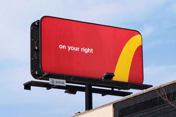
This billboard from McDonalds ‘slashes’ the price difference of their Big Mac
Love them or hate them, McDonald’s has always managed to produce inventive advertisements and this latest offering is one such example. Created by advertising agency DDB Stockholm, this billboard takes an innovative approach to “slashing prices” on the border of Norway and Sweden. Highlighting the price differences on the cusp of each country, the advert showcases how much cheaper the Big Mac is in Sweden.
03. British Airways
This design from British Airways certainly got our attention. Designed by the Ogilvy Group UK, the company uses surveillance technology to track the flights – allowing a child to point to the overhead flights in real time. BA head of marketing Abigail Comber explains, “This is a first, not just for British Airways but for UK advertising.”
Channelling that childlike excitement of seeing your first ever aeroplane, the billboard is a truly marvellous example of interactive design. You can see the billboards in London’s Piccadilly Circus and Chiswick.
04. OREO
One of America’s favourite cookies, Oreo celebrated its 100th birthday with the ‘Wonderfilled’ campaign, and The Martin Agency were tasked with creating a series of inspiring animations. They then teamed up with Brand New School to take over the largest advertising space in the United States – Times Square.
“It’s an amazing venue that allows the work shine in a dynamic space that naturally fills people with wonder,” creative director of Magnus Hierta enthuses. “This piece also takes advantage of the Times Square space by creating a visual tapestry of sharing that spreads across the screens and leaps from building to building.”
05. Formula Toothcare

This billboard design tears apart the usual billboard design
An utterly creative billboard design for Formula Toothcare, with the tag line ‘builds strong teeth’ taken to extremes. The ‘broken’ metal frame makes the billboard design look all the more realistic and eye-catching – ensuring a strong execution in delivery. This would certainly catch our eye if we were walking past.
06. BMW
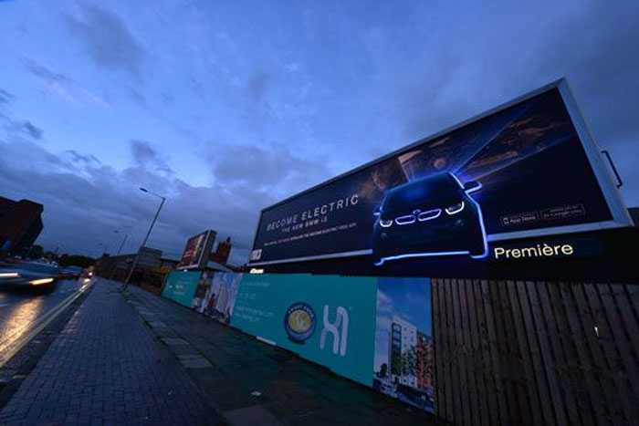
BMW pushes the electric element of its new car with halo lighting
Out-of-home communications agency Posterscope developed an illuminating outdoor advertising campaign to promote the BMW i3, which is claimed to be the world’s first premium fully electric car.
Posterscope’s Hyperspace division worked closely with BMW’s creative agency, WCRS, on the attention-grabbing campaign which incorporates ‘Halo’ lighting into customised billboard special builds to create an after-dark glow effect around 2D cut-outs of the i3.
Key parts of the car are separately illuminated to highlight the models hi-tech eco-friendly features and electric inner workings, while a cutting-edge printing technique accentuates the contrast with the backlit skin.
Part of a larger £1m campaign running on across roadside, rail and underground sites in the UK, the advertising also encourages consumers to download a companion mobile app from the App Store, enabling them to take a virtual test drive in the BMW i3.
07. Orphea
Orphea4D Protection is a powerful insecticide spray for exteriors. This brilliant campaign promotes the brand by transforming a normal billboard into a huge insect trap. Transparent glue was applied on a portion of the billboard in a recognisable shape and when flies and mosquitoes got trapped there, they made the shape visible.
08. C.A.L.M.
Street art can be a great way present a powerful message. To raise awareness of the charity C.A.L.M. graffiti artists Soulful Creative created these brilliant billboards.
The posters aim to highlight the fact that three men under the age of 35 take their own lives every single day in the UK. The lighting is also a very nice touch – ensuring that passers-by will almost certainly take notice of the billboards.
09. Nike: Knitting
To promote their latest Free Flyknit sneakers, Nike got together with advertising giants Wieden + Kennedy Shanghai to knit a humongous shoe onto a billboard. With the help of three workers, strips of neon green were threaded together to create the shoe on top of a bare foot. The live knitting sessions took place on Nanjing East Road, one of the most heavily trafficked streets in Shanghai, raising more than a few eyebrows…
10. iPod and iTunes
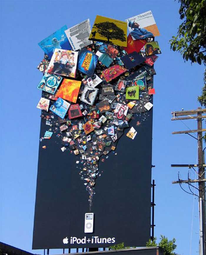
There’s no confusion as to what Apple are trying to say with this billboard design
Apple made sure there’d be no chance of missing this advertising campaign for its iTunes store and iPod. Towering several feet in the air, the attention-grabbing design features a fountain of products that can be purchased and enjoyed on the popular portable media player.
Apple’s message is simple: combine an iPod with iTunes and you have an endless source of entertainment at your fingertips.
11. Black Tower Home Security
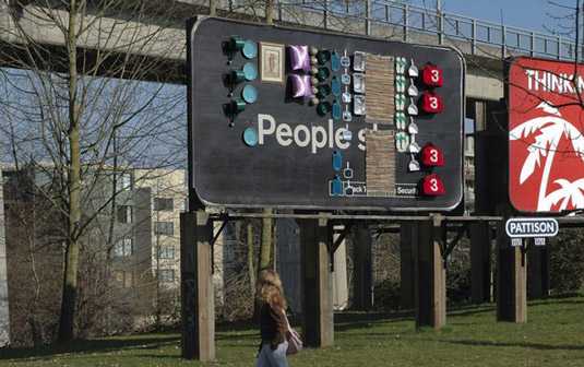
TBWA/Vancouver prove that people do, indeed, steal in this brilliant campaign for Black Tower Security
In a campaign for Black Tower security, advertising agencyTBWA/Vancouver demonstrated that some people will take whatever they can get their hands on.
The agency lined a 10x20ft billboard with sought-after household items like framed paintings, rugs, pillows, and cookware on a Friday afternoon. By the end of the weekend, the board was bare, revealing the campaign’s simple anti-theft message: ‘People Steal. Black Tower Home Security’.
12. Sky Discovery Channel

This original, wind-powered billboard design was created by DDB New Zealand
This eye-catching design for the Discovery Channel was developed by advertising agency DDB New Zealand.
A working model, the design replicated a circuit board demonstrating how various different elements work – the wind turbine powering the batteries, which stored power until the display read ‘full’, activating the neon lights and finally the light box revealing the Discovery logo.
13. BBC World

Clever use of corner billboards in this campaign for BBC World by BBDO New York
When BBC World became available in the US, BBDO New York chose amazing photography and clever billboard placement to tell the country the international news channel had arrived.
The imagery, taken from events around the world, is enough to grab your attention alone. But the BBDO team cleverly used corner billboards to show different takes on the same situation. Simple but very effective.
14. Kill Bill
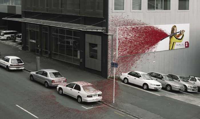
Saatchi & Saatchi New Zealand drenched the wall, sidewalk and three shiny white cars in its promotion for Tarantino movie Kill Bill, Vol 1
Advertising agency Saatchi & Saatchi New Zealand went all out a few years back when promoting Quentin Tarantino’s Kill Bill, Vol 1. The cool billboard design features Uma Thurman, her priceless Hatorri Hanzo and an impressive wall spatter of blood.
The installation was erected at a busy Auckland intersection to promote a local channel’s screening of the movie. If anyone was in doubt as to what the film entailed, Saatchi and Saatchi made it crystal clear with this design.
15. Miele vaccuum cleaner
In order to promote the power of the Miele S8 monster suction vaccuum cleaner, Bratislava-based adverting agency Mayer McCann Erickson placed this brilliant billboard design over a well known tunnel.
The agency then filmed trafffic over a period of time, resulting in this video that gives the impression of various vehicles being sucked into the vaccuum pipe.
16. McDonald’s sundial billboard

This billboard from McDonalds ‘slashes’ the price difference of their Big Mac
The print on this McDonald’s billboard is nothing to write home about. But the addition of a sundial mounted on top turns it an innovative and brilliant piece of design. Displayed is the fast food giant’s breakfast menu, with the sun casting shadow on each item that corresponds to the time of day you would normally eat it.
Created by ad agency Leo Burnett, the sundial not only points out what meal you should go for, it also creates a shadow of the restaurant’s infamous ‘M’ as it does so.
17. The Economist – Light Bulb

UK-based creative agency Abbott Mead Vickers BBDO was the brains behind this ingenious light bulb billboard design
This simple yet ingenious design comes from UK-based creative advertising and brand management agency Abbott Mead Vickers BBDO. The ‘less is more’ idea features a giant lightbulb popping out of the centre of a red background, the only words reading ‘The Economist’.
Using electronic motion sensors, the bulb lit up every time someone walked underneath it. A brilliant, effective way to get the message across.
18. Koleston Naturals: Change

Leo Burnett came up with this clever concept for Koleston hair colourant, which uses the sun as part of its design
Advertising agency Leo Burnett like incorporating the sun into their awesome designs, including this one for hair colourant Koleston Naturals. The innovative design features a woman’s hair die-cut in the billboard to capture the variations of Koleston naturals’ colors through the different phases of the day and night.
Th effect the sun has on this design is just brilliant, with the model’s hair colour changing from blonde to black in just a few hours.
19. Bleeding billboard

In an attempt to reduce fatal accidents on the roads in New Zealand, ColensoBBDO created this billboard design that bleeds when it rains
The concept for this powerful billboard design came from New Zealand-based creative agency ColensoBBDO. The team was approached by South Auckland local government bodies with a brief to create a design that would lower the number of fatal accidents on the road.
Noticing that accidents had increased during a particularly wet Easter the road safety team put up this billboard that bleeds when it rains. The message? “Rain changes everything. Drive to the conditions.” If that harrowing image doesn’t make people slow down, we don’t know what will.
20. Nose hair trimmer

Saatchi & Saatchi Indonesia incorporated real-world elements into its design for Panasonic’s nose hair trimmer
We love this comedic design by Saatchi & Saatchi Indonesia for Panasonic’s nose hair trimmer. The billboards were built around actual wires and poles in Indonesia to amusingly advertise the need for the device and showcase its safety cutting system.
So if you’re afraid to trim sensitive nose hair, this could be just the product for you. A fun and innovative idea.
21. Colorado State Patrol

Keep your eyes on the road, not this brilliant billboard by Amelie Company
“Tailgating isn’t worth it. Give Trucks room. It’s the law.” That’s the message that features on this brilliantly designed billboard by French-American advertising agency Amélie Company for the Colorado State Patrol.
It’s simple, keep your distance or end up looking like the billboard. This is one design that will certainly grab the attention of drivers. Although let’s hope the cool campaign doesn’t keep their eyes off the road for too long!
22. Science World

We wonder how long it took the Rethink team to glue 9,000 diamonds to this billboard?
The guys at advertising agency Rethink, Canada have teamed up with the Science World Museum to create a series of brilliant billboards, dedicated to promoting science in Vancouver. And this eye-catching design is no exception. The Rethink team glued 9,000 glass diamonds to a billboard to promote Science World’s Treasure exhibit. And to demonstrate that, compared to many other gems, diamonds aren’t all that rare.
Other brilliant designs include a board covered in pure gold and a stick man made from 9,000 pencils.
23. The Day After Tomorrow

The team at ad agency Contract came up with this innovative way of advertising the 2004 disaster movie The Day After Tomorrow
In order to promote Roland Emmerich’s 2004 global-warming disaster movie The Day After Tomorrow to Indian audiences, ad agency Contract submerged a billboard in the sea not far from Mumbai. The idea being to mimic the idea of Manhattan being overwhelmed by water, the team also placed a replica of the Empire State building further out to sea.
Leaving just the details of the film’s release and venue, the marketing campaign attracted the attention of many a passer by.
24. Smart: Little billboard

BBDO Toronto promoted Smart car’s low impact on the environment with these itty-bitty billboards
This pocket-sized design proves that when you have a good idea, size really doesn’t matter. In keeping with Smart car’s low impact on the environment, instead of using big billboards that pollute the environment, advertising agency BBDO, Torontocreated a series of scaled down versions.
The miniature street advertising boards were placed in various locations around Toronto, all of them celebrating the beauty of being small.
25. Wrench billboard
There’s certainly no hidden message in this campaign for Craftsman Tools by ad agency Y&R, Chicago. The impressive billboard featuring a giant, lifelike hand holding a wrench aimed to promote the DIY store, using the tagline, “Trust. In Your Hands.”
Released back in June 2011, this is a perfect example of direct marketing that almost certainly would’ve caught the eye of every passer by.
26. Invisible
Okay, so it’s not a billboard and more of a giant poster, but we had to include this brilliant yet touching campaign. The Australian Childhood Foundation partnered with advertising agency JWT to create this unique and powerful billboard design, with the aim of raising awareness of neglect as a form of child abuse.
The installations were located at popular sites around Sydney, featuring a huge poster pasted over a child-sized mannequin. The design secured the JWT team the Bronze Lion at Cannes Outdoor Lions in 2010.
27. Nike: Run
Many companies have taken on a transparent billboard idea when developing advertising campaigns. But we particularly like this one for Nike, which encourages people to keep running when they ‘hit the wall’.
From the image, it’s difficult to attain whether this a photo pasted on to a board or a frame you can actually walk through. But we’d like to think it’s the latter, otherwise runners beware!
28. Levis

Levis lets its product do the talking in this billboard design
Founded back in the mid 1800s, Levi Strauss and Co has since become known worldwide for its Levi brand of denim jeans. With such a recongiseable brand and product, a simple but clever design was all that was needed for this billboard.
Here, Levis lets its jeans do the talking, featuring a section of a giant pair of 501s, unbuttoned to reveal not only the the infamous numbers, but realistic detailing in the denim, stitching, buttons and rivets.
29. Heineken

This eye-catching design was developed by advertising agency TBWA
This billboard for Heineken is a perfect example of how a small and simple idea that’s perfectly executed can have a big impact. The three dimensional concept features a hand seemingly coming out of the background about to grab the bottle of beer.
The concept for the billboard, which graced the city of Amsterdam, was developed by the team at advertising agencyTBWA.
30. Absolut Vodka

Absolut’s long-running ad campaign transformed an ordinary billboard into a stylish NYC apartment back in 2000
Absolut Vodka’s long-running advertising campaign is one of the most successful consumer products campaigns in the history of advertising. Known for it creative design, the company outdid itself back in 2000 when it created this eye-catching billboard.
After teaming up with fellow Swedish global brand IKEA, the company transformed a billboard in Manhattan into a stylish, but cramped, New York City apartment turned on its side – and shaped like an Absolut bottle. Genius.


